 |
| 8. Flybe Don't be too simple |
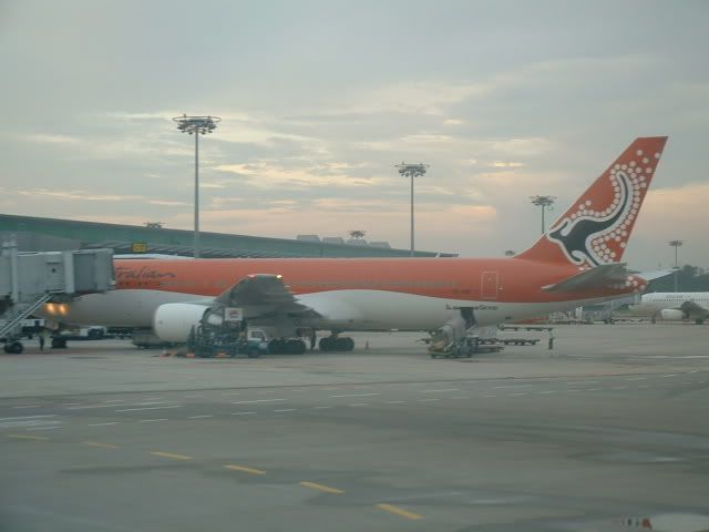 |
| 7: Australian Airlines (2001-2006) Ok, but not great. |
 |
| 6. Southwest Airlines You're a big airline but get your act together with those colors |
 | ||
| 5. OzJet Racing checkers? Really?
|

 |
3. Royal Brunei Airlines 2. Air Koryo  1. Dubrovnik Airlines
For a livery to get on a plane, there have to be multiple people that approve it. I mean it costs the same amount of money to paint a good livery or bad one — which always makes me wonder how liveries like this every see the light of day.
Sure, the concept of putting a pretty photo to show where you fly is not a bad idea (and it is pretty — close up shot). However, this looks more like it was designed in Microsoft Word than almost any livery I have seen.
The word “airline” doesn’t even match up with the name and is oddly next to that picture. On the left side of the plane, it is no better with the name being oddly close to the picture.
According to Flight Global, the airline suspended operations on October 23, 2011. There is a possibility they could come back into service and I wish them the best — I only ask to think about going with a new livery.
|
No comments:
Post a Comment